The iPhone/Android flavor comes with new widgets in version 8 that expose greater touch surface, work faster or reduce errors.
Version 8 improves the existing widgets in the iPhone/Android flavor so they are even easier to use. There is a new, native Date Picker, you can use a label for check-boxes and insert Action buttons in any cell.
A native Date Picker is built-in in many mobile devices and provides a standard way to set a date. You have probably already seen a Date Picker in action, e.g. in the Alarm settings. With version 8, SpreadsheetConverter now enables you to use this Date Picker in your mobile calculator.
Besides Date, we also provide a Time, Month and Week Picker. All these options are available under the Text Field widget.
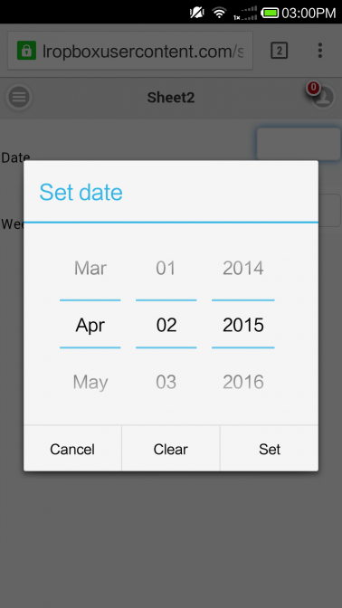
Date Picker displayed in Android device.
It lets you pick a date by scrolling through the Year, Month and Day, or you can type the date directly into the field.

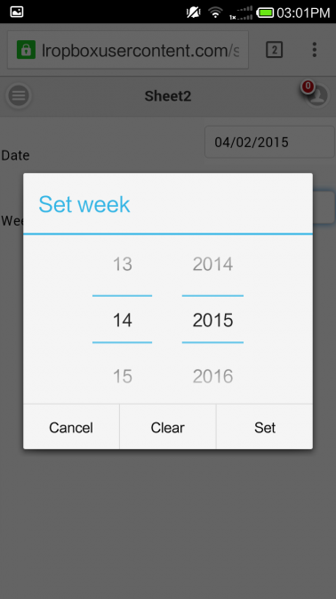
Week Picker displayed in Android device.
It lets you pick a week number and year. It is useful when something happens in or during a particular week.

Using a check-box without text usually makes no sense. There has to be a descriptive text so people know when to check the box or not. Previously, you always had to use an adjacent cell to provide this text beside the check-box widget. This had couple of drawbacks:
Version 8 adds a Label property for the Check-box widget. After you’ve converted the spreadsheet to a web page, the label will appear next to the check-box. Unfortunately, the Label you set here cannot be shown in Excel.
There are two sub-types of Check-boxes: Touch and Toggle.
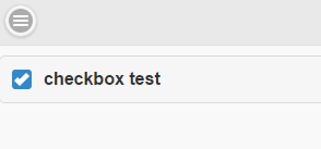
Touch Check Box
As usual, the check mark in the Touch check-box reflects the value of the widget – if it’s checked the value is TRUE.
You can now tap also on the label to check/uncheck the box. This gives you a much greater touch surface. Scan the QR code below with your phone to test for yourself.
When you add a Touch check-box to a spreadsheet, it is initially set to FALSE. When you convert the spreadsheet to a web page, a Touch check-box widget will therefore initially be unchecked. If you change the default value by typing TRUE into the widget’s spreadsheet cell before conversion, the check-box will be checked when the page is opened in a web browser.

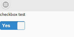
Toggle Check-box
With the Toggle check-box, the label will appear above a small graphic that resembles an electric switch. Users can drag the handle or tap one side of the switch to toggle the check-box.
When the you flip the switch to the right, it returns a TRUE value. Flip it to the left and it sets a FALSE value for the cell.
A Toggle Switch has three labels: one that shows what the switch does and one for each state. You can use up to four characters for the On Label and Off Label, like On/Off or Yes/No. The On Label is visible in the switch when the value of the cell is TRUE and the switch is flipped to the right.
Only the selected state is visible in the widget, e.g. Show. Your users will assume that flipping the switch will set the opposite state, e.g. Hide.
When you add a Toggle Switch check-box to a spreadsheet, it is initially set to FALSE. When you convert the spreadsheet to a web page, a toggle switch will therefore initially be in its “off” position, flipped to the left. If you change the default value by typing TRUE into the widget’s spreadsheet cell before conversion, the check-box will be flipped to the right and showing the “on” label when the page is opened in a web browser.

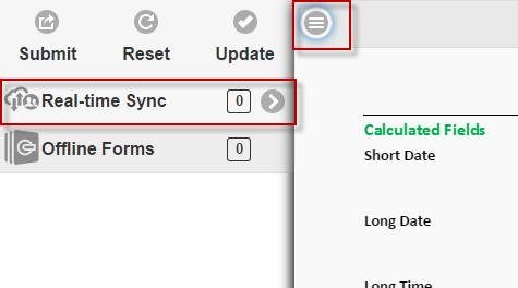
The Submit, Update and Reset buttons are the standard action buttons in your iPhone/Android calculator. That’s why we put them on the most accessible place – at the top of the Side Menu. Touch the “hamburger” in the upper left-hand corner and you see them.
However, sometimes you may want to place an action button elsewhere, perhaps to simplify the user interface. Using widgets, action buttons can be inserted in any cell in the calculator. The text of all buttons can also be changed.
The Submit button send the form to a web server for processing. Insert a Submit button at the end of your long form to save your users from having to scroll back to the top to reach the Submit button in the Side Menu.
For smaller calculators, SpreadsheetConverter automatically updates all cells in a spreadsheet if one of the values is changed, just like Excel does. For a very complex web calculator, you have the option of switching to manual updating of the calculator. In that case, an Update button is needed to manually initiate the updating of the spreadsheet.
You can now place also the Update button in any cell, perhaps right after your most popular input fields.
The Reset button clears all input fields in a form. It is rarely used, except in situations where a large number of fields contain values that never will be re-used. You can now make the Reset button available where-ever users need it.

Read our online help on how to insert and configure these new widgets.